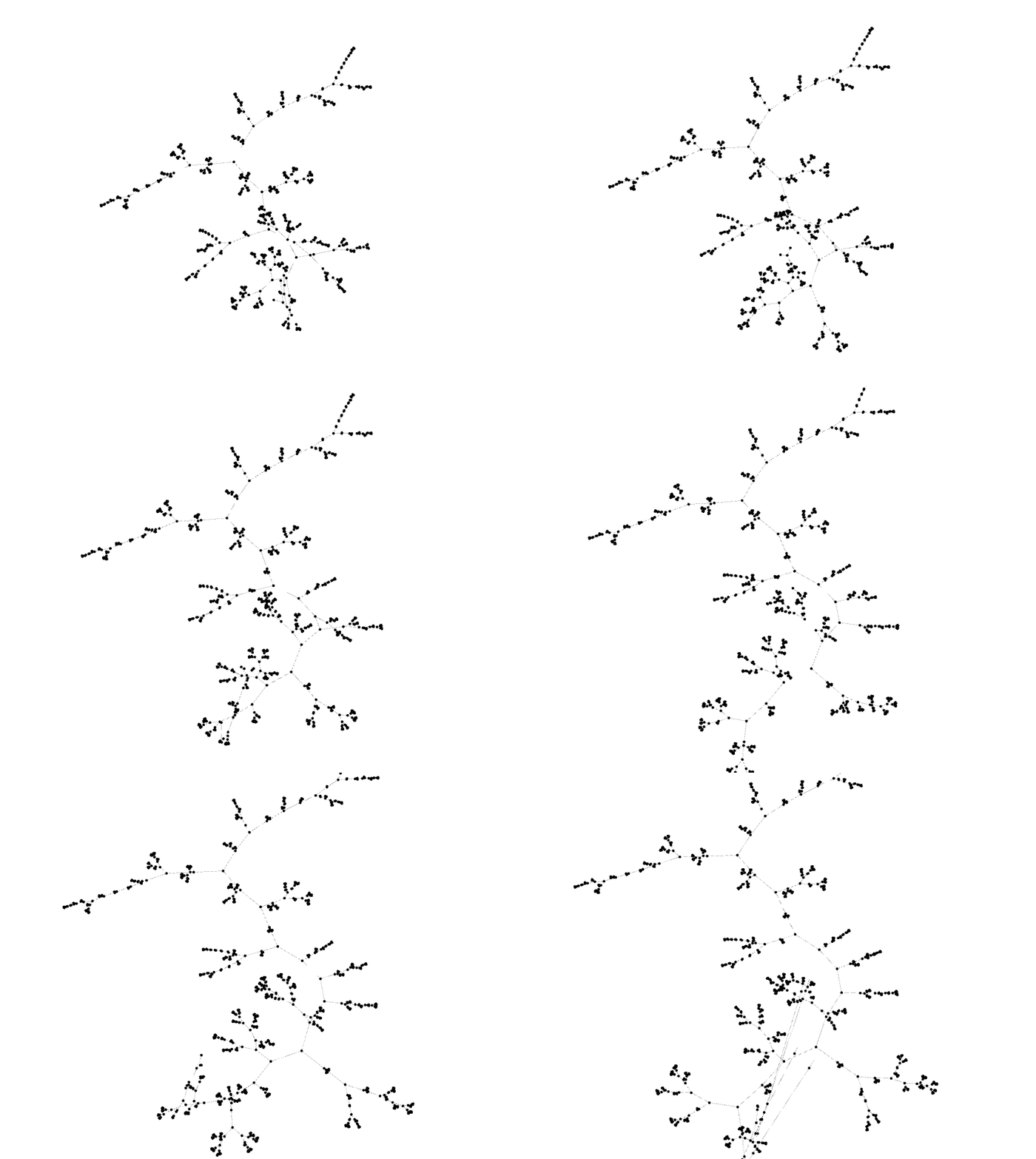
As part of a side project, I ended up producing a large dendrogram. Roughly 22,000 items were clustered, which produced over 44,000 nodes! Plotting such a large dendrogram is tough.
After trying to convince some tools to render a dendrogram this large in a way that is useful, I decided to render it as a graph using Gephi instead. While Gephi is not incredibly intuitive to use and isn’t the most stable piece of software, it is the easiest way to render large graphs. Rendering the dendrogram as a graph throws away the dissimilarity aspect of the rendering, but for a dataset this large, it’s tough to parse that anyway.
To get the best layout possible, I ended up using Gephi’s timeline feature. It was a little tricky to get right, so I thought I’d document the process here in case it’s useful to others.

