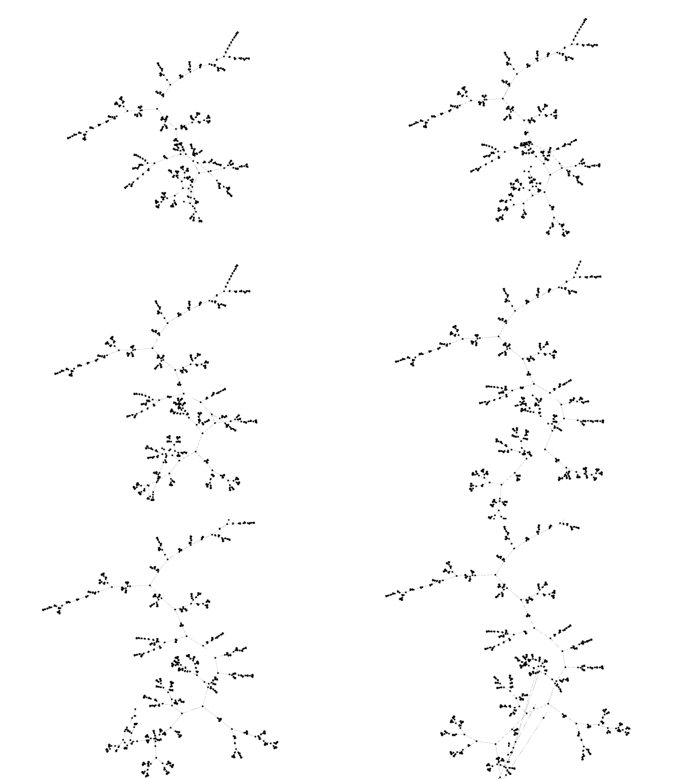
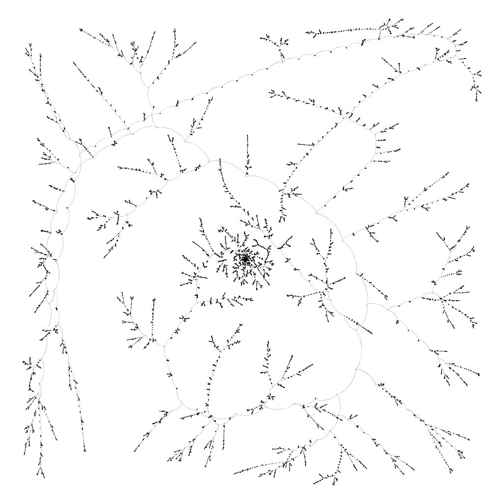
As part of a side project, I ended up producing a large dendrogram. Roughly 22,000 items were clustered, which produced over 44,000 nodes! Plotting such a large dendrogram is tough.
After trying to convince some tools to render a dendrogram this large in a way that is useful, I decided to render it as a graph using Gephi instead. While Gephi is not incredibly intuitive to use and isn’t the most stable piece of software, it is the easiest way to render large graphs. Rendering the dendrogram as a graph throws away the dissimilarity aspect of the rendering, but for a dataset this large, it’s tough to parse that anyway.
To get the best layout possible, I ended up using Gephi’s timeline feature. It was a little tricky to get right, so I thought I’d document the process here in case it’s useful to others.

I had a hypothesis that the way to get the best layout would start with the “root” node and progressively add child nodes while the layout algorithm runs. This should preserve as much of the tree structure as possible.
Preparing the Nodes
First, I walked the graph in breadth-first order to label each node with the order in which it should appear. This labels the root with 0, the first left child 1, then first right child 2, the left child’s left child as 3, and so on.
Next, I added a “label” attribute to each node. For the “merge” nodes of the dendrogram, I left the value empty. For the “item” nodes, I set the label to the ID, which happened to be descriptive in my project.
Finally, I dumped that data to CSV with the headers Id, Label, and Order. I then imported this node table into a fresh Gephi project, using Integer type for Order. Make sure to choose Timestamp as time type.
Preparing the Edges
I walked the dendrogram again, creating an edge from each parent node ID to its left child node ID and right child node ID. (So, each “merge” node has two edges: one each for the left and right children.) I was careful to make sure the ID values agree with the values already imported using the node table.
I dumped that data to CSV with the headers Source, Target. I then imported this edge table into the same Gephi project. Make sure to choose Timestamp as time type and “Append to existing workspace”!
Configuring the Project
To animate the appearances of nodes, I copied the Order column to the Timestamp column by using “Duplicate column” command on the nodes table in the Data Laboratory tab.
Next, I enabled the timeline by clicking on the “Enable Timeline” button at the bottom of the Preview tab. I then configured the Timeline view to reveal the nodes gradually over 15min by twiddling the Delay and Step Size values carefully, using One boundary.
Executing the Layout
Normally, I prefer to use the Fruchterman-Reingold layout, but because of the size of the graph, I chose ForceAtlas2 instead because it’s much, much faster.
I executed a Random Layout to get a consistent initial state.
I then started the layout, and started the timeline player from the beginning of the timeline. This caused the timeline to run while the nodes were added gradually.
Results
The result was an outstanding dendrogram layout, as I had hoped!

Notes
- Gephi crashed on my Mac laptop a few times while I was trying to make this work. As long as I was very careful about how I manipulated the timeline and layout features, I was able to get it to work. But save often!
- Save your progress in different files to “snapshot” your progress as you go. This process is ticklish, and you’ll appreciate the checkpoints later.
- I ended up tweaking ForceAtlas2 quite a bit to get a layout I was happy with:
- Be sure to enable “Approximate Repulsion.” It applies Barnes-Hut approximation for the repulsion force in the layout, which is a substantial speedup!
- Do not enable “Stronger Gravity.” It can collapse your whole layout into a clump in the middle of the workspace, forcing you to start again.
- Gephi has a maximum layout size. If the layout tries to grow past that size, then nodes just hit a “wall,” which doesn’t look good. If there is a way to increase this limit, I could not find it. I ended up tweaking Scaling and Gravity in ForceAtlas2 to fit within the limits. My final values were Scaling=1.0, Gravity=5.0.
- When you’re happy with the layout, enable “Prevent Overlap” in ForceAtlas2 and run the layout for a few more iterations. This will reduce the extent to which your nodes overlap each other. It seems to freeze the other motion of the layout, which is why it isn’t useful throughout the layout process. It’s also substantially faster than the “Noverlap” layout, which ostensibly reduces node overlap, too, but much slower. The docs suggest you disable “Approximate Repulsion” during this step, but it seemed to run OK for me regardless.
- I found that it was important to start from a random layout, but YMMV.
